
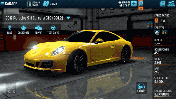
RACING RIVALS
As the lead UI/UX designer, I executed a comprehensive redesign of Racing Rivals, a popular mobile racing game. Our mission was to breathe new life into this product through user-centered design and data-driven decision-making.
Despite having attracted a significant player base, Racing Rivals was struggling with poor retention and monetization.
Our primary challenges were:
- 1. A disconnect between new and experienced players
- 2. Low First-Time User Experience (FTUE) completion rates
- 3. Subpar retention metrics compared to industry standards
- As a result of my efforts, FTUE completion almost doubled
We were able to achieve better retention D1 through D30
UX RESEARCH & INSIGHTS
Mixed-Methods Approach
To gain a holistic understanding of our users and their needs, I employed a mixed-methods research approach:
- 1. Quantitative Survey: Conducted a large-scale survey with over 700 respondents, providing valuable insights into player preferences and pain points.
- 2. User Interviews: Held regular player council meetings with our most engaged users to gather qualitative feedback.
- 3. Analytics Deep Dive: Analyzed user behavior data to validate findings and identify key areas for improvement.

You normally try to answer “what..?” with quantitative research.
It’s interesting that sometimes you can also answer “why..?”
Our research into player perceptions revealed several important findings:
From the perspective of existing players, the game's core experience wasn't fundamentally flawed. However, they did express some frustrations. These primarily centered around technical issues, followed by requests for new features, and finally, suggestions for gameplay refinements.
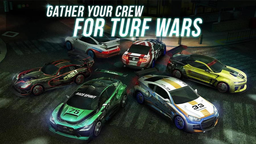
Notably, players consistently identified "Turf Wars" as the game's most valued feature. This game mode stood out for several reasons:
- 1. Social Engagement: Turf Wars served as the primary social event, where players formed teams and competed against each other.
- 2. Exclusive Rewards: It offered unique prizes that weren't available through any other means in the game.
- 3. Community Status: These rewards acted as status symbols within the Racing Rivals community, signifying a player's skill and dedication.
This insight highlighted the critical role of social dynamics and achievement-based gameplay in retaining our core player base.
It became clear that Racing Rivals wasn't just about individual racing performance, but also about being part of a larger, competitive community
Key Insights
- 1. Experienced players were highly engaged with incredibly low churn rates.
- 2. The "Turf Wars" feature was identified as the most crucial aspect of the game, driving social engagement and status.
- 3. New player onboarding and retention were the primary areas requiring improvement.
- 4. In-game UI prompts were misleading, creating a mismatch between player expectations and actual gameplay mechanics.
UX STRATEGY & SOLUTIONS
FTUE Redesign
- Goal:
- Increase FTUE completion rate and improve early-stage retention.
- Approach:
- • Simplified the tutorial flow, introducing complexity gradually.
- • Iterative design process: Flow diagrams → Sketches → Prototypes → User Testing
- • Continuous refinement based on player feedback and completion metrics.
During the initial stages, I would go back and forth between the FTUE flow diagram and simple sketches...
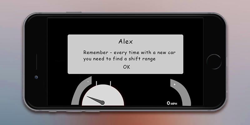
...which were then turned into prototypes...
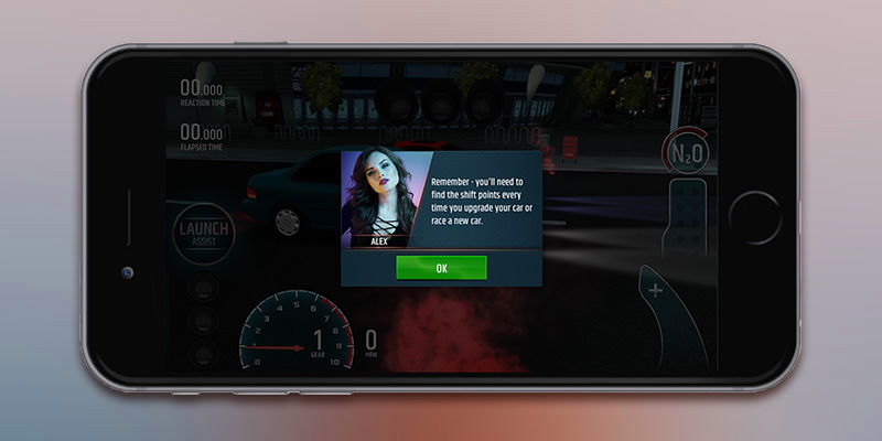
...and tested with real players as they progressed through the updated tutorial.
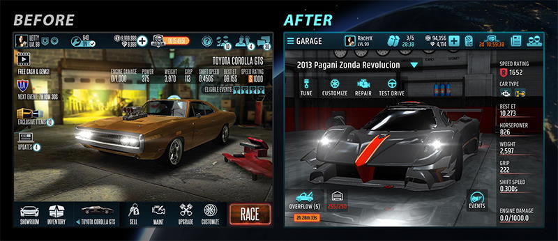
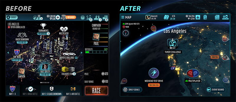
NEW UI AND NAVIGATION
- Goal:
- Create an intuitive navigation system aligned with user mental models.
- Approach:
- • Redesigned the navigation structure to make all screens accessible within a single tap.
- • Implemented a clear distinction between main destinations and overlay screens.
- • Refined iconography, typography, and visual design to enhance usability and aesthetics.
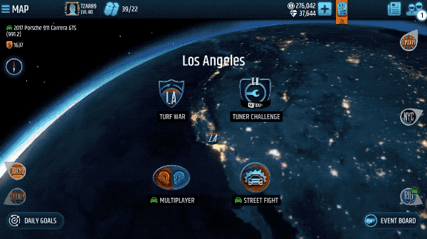
Destinations: accessible via the hamburger menu, transition through the loading screen
Overlays: accessible via the HUD, transition through sliding down (up)
I refined the iconography, typography, backgrounds, animations, and overall UI direction.
RESULTS & IMPACT
- Our UX-driven redesign led to significant improvements in key metrics:
- • FTUE completion rate nearly doubled.
- • Improved retention from Day 1 through Day 30.
- • Enhanced overall user satisfaction, as evidenced by positive player feedback.
LESSONS LEARNED
- 1. The importance of aligning the conceptual model with actual gameplay mechanics.
- 2. The value of a mixed-methods research approach in understanding diverse user needs.
- 3. The critical role of iterative design and continuous user testing in creating effective UX solutions.
AFTERMATH
While the game ultimately faced challenges in monetization, the UX improvements demonstrated the power of user-centered design in revitalizing a struggling product. This project showcases my ability to lead complex redesign efforts, leverage data-driven insights, and create impactful UX solutions in the competitive mobile gaming industry.